BEYOND THE FRAME
- Malcolm Ryder
- Feb 9, 2025
- 6 min read
What’s In A Name?
The title of this show, Beyond the Frame, immediately gets us asking questions. Is the frame physical, or metaphorical? Actual or virtual? Is the idea about what is new, outside of the familiar? Or what is presented outside of what is conventionally allowed?
A Celebration of Large-Scale Art, the subtitle for the show, then helps out: size matters. Now we know that what we’re looking for is an experience that size creates, which otherwise might not be offered by the work.
One of my favorite riffs on this is “breaking” the Fourth Wall of theater: making the audience a part of the “reality” on stage by extending the action into the seats; it breaks through the imaginary wall left where the opened curtain has vacated. This is exciting because the stage creates a psychological space large enough to contain us, and then that space gets even bigger and envelopes us.
Got it; this exhibit’s subtitle tells us to be on the lookout for how works at large scale create a psychological space larger than ourselves. And as the central feature of the show, the artworks generally use a canvas or board so large that its original literal function as a working area for the artist turns the artist’s creative effort into a performance. As we “read” the work and follow the effort, that performance then projects the emotional and conceptual space into which we go.
But hold that thought.
What comes with the first few seconds of standing in the show gallery is a different emphasis. We hadn’t been told in advance that it is surveying how visual abstraction generates this emotional and conceptual space, even in the figurative work on display.
Now, in the following, by investigating the variations on that theme, I’m flirting with making the meaning of “abstraction” less clear, not more. But I will say that all the works lean towards a certain effect in common: the work viewed is not “about” some other experience; the qualities of the work’s presence is the experience.
Appearance and Reality
So, what is this presence about? So often, abstraction generates an effect that we might for personal reasons call “beauty”; but that characterizes the finished object that we’re calling artwork. More interesting, I think, is our awareness of what is going on in the work’s space and is coming out of it – which sees that object as an instrument used by the artist to convey something. In other words, this is focusing more on the intent of a work as a “medium”. A medium is a channel that allows and helps transport something from one “place” to another one. We distinguish different mediums by how they get that done. And here the medium carries the artist’s concern to us. The artist picks and uses the medium and its characteristics, instrumentally.
In that sense, what I noticed in this show is that abstraction facilitates what I’ve called the artist’s performance, and it’s the performance that connects us to the work. Throughout the show, we can peruse the varied “performances” of the artists along with the size that lets them do it.
The Art of Work
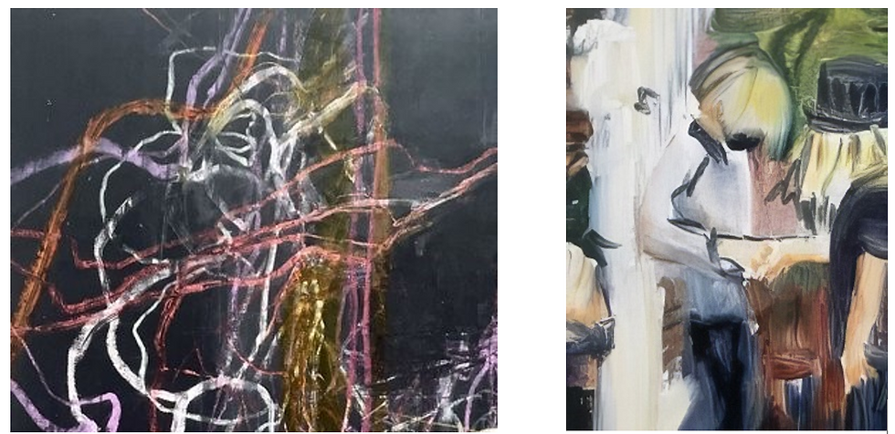
For example, few things convert a static image into a dynamic one as does the way a line, even with no intention of representation, triggers our impulse to follow along with it. This is directly comparable to the idea of a melody in music. Likewise, multiple lines can co-exist in ways that mutually affect how each is felt while followed – whether harmoniously or not. John Woods’ works remind us that drawing generates a sense of simultaneously creating a space and navigating it, finally inhabiting it.
But a line’s work can of course segment that space into figures, or shapes, such as done by Christine Ferrouge; and while that line mainly sets edges (boundaries), it can also make the figures animated.
The common denominator there, in the drafting and figuration, is that line in the work is gestural, and gesture can be very attracting because it can be mimetic, evocative, or both. In Ferrouge’s pieces, gestural line makes body language deftly indicate the kind of moment that is seen, but scale makes that gesture more physically equivalent to our own, generating sense memory as the kind of space we then inhabit. We might be more familiar with this phenomenon from sculpture, but here it is in the 2D imagery of the wall work.
The other set of shape-sensitive work, by Judith Foosaner, also exploits what large scale offers, but in this case the effect is telescoping in on something, which makes it bigger in our field of view. Figuration here is abstract on the level of icons – shapes that have just enough information to point out something we are already familiar with. That creates orientation for us. But in the zoomed-in view, order and pattern that may normally miss our attention are revealed, and this revelation brings the energy of a small epiphany – that quietly, if not secretly, we are part of some greater plan in life’s organization.

Color of course also gets identifiable jobs in the exhibit. One, as seen in Simone Simon’s work, is as an indicator of spatial depth, inherently referring to light as a dimension of the real space in our living experience. But another job is to just be a form of energy that infuses us. Even if we don’t know who first said that red is passionate or yellow is joyous or aqua is soothing, most of us have no quarrel with given colors corresponding to given feelings. And here the color’s presence is not about solving the problems of a frame’s influence on image construction. Rather, it invokes a condition that we know makes a boundary meaningless to our encounter. The work’s size amplifies the presence of the color, which creates the psychological space we enjoy: empathy.

Meanwhile, in work by Javier Manrique a far more textural, nearly tactile handling of color as lines creates an all-over coverage of the surface, and like Simon’s ethereal work, needing no reference to borders. (Sidebar: I can’t resist noting that smashing textural and tactile together gives “textile”, and now I have more homework to do. But I defer to Manrique’s own artist statement on view – come read it at the gallery, or online here.)
In two other cases, works by Michael Shemchuk and Mary Ann Leff bring the technique of contrasting two different scales within one piece, suggesting that differing scales already have differing built-in effects. It’s not news but again the work is not about the experience; rather it is the experience.
This time, one set (Leff’s) intentionally does show a preoccupation with the frame’s influence on the construction of the piece. From within the available area, some of the pictorial elements, usually the larger ones, get to reach the frame while other smaller ones usually do not. This is a simple drama that we can lean into, and the framing, like staging, does not restrict as much as it focuses attention. That attention further suggests things that aren’t even there yet or that could happen.
The other large works, by Shenchuk, deliberately compare big sharply defined rectangular areas of somewhat industrial color coverage against small, ragged areas of apparently indifferent spontaneous removal. But mostly the work projects both occurrences as “intentional”. Due to large scale, each artwork in this set immediately echoes urban streetside walls, invoking a narrative that the piece wants to specify yet shows no attempt to make captive to time or place. Given all that, the even distribution of the “blemishes” on the surface of the works approaches parody but goes back to the aspect of seeing the artist performing the work.

Finally, there is work that yells “free jazz” to me – an intentional refusal to direct the evolution of the piece in any way other than by reacting to (visual) discoveries that occur along the way. This work, by Dulama LeGrande, harkens back to the color line work I initially mentioned by John Wood. But in comparison, LeGrande’s is dedicated to being unrestricted in shape, color, or any aspect of form, in an exploration about what effects are possible, rather than about what is possible from a given effect.

Walking the Talk
The dialogue between the sets of work by LeGrande and Wood is captivating and reminds us that the arrangement of all the works in the show purposefully get them engaged with each other, generating more layers of experiences for us. It rewards second and third looks at everything. Consequently, the more time you spend within the gallery’s walls, the bigger the show seems to get. This is exactly why you want to be actually standing among the collected works, on land not online. The show, in progress, remains mounted at the gallery until March 8th.
-- Malcolm Ryder
Images included: excerpts of all works courtesy of Gray Loft Gallery and the artists.
Artworks represented: property of the designated artists. All rights reserved.
A special note: in a show like this, many things ranging from theater to conceptual and performance art, to flash mobs, graffiti, Jasper Johns and Cy Twombly filter through the mind. Thanks here to artist John Wood, who in sharing our ideas about drawing and museum going, discovered and burnished our mutual appreciation of the idea of performance in art making, reflected in this article.


Comments